A Mobile App Encounter That Encouraged More Education
8 month personal project in 2018 • 4 min summary • 17 min read
This is my story about how in 8 months I redesigned a local transit app creating 8 high-fidelity prototypes, 4 inspired by Google’s Cloud Vision, without prior experience using a Mac or developing a mobile app to demonstrate a working knowledge of Sketch, Principle and Material Design by implementing my Android app concept.
While on my pursuit of professional development, I’m always curious, always learning and this mentality has led me down many interesting paths. And after moving to Chicago I became so inspired how the Google Maps app improved my city life I felt it was time to take the less safe path to learn the skills and software to prototype a mobile app.
"So I left my design lead role of 13 years to position myself for new career opportunities and moved back home with my parents to invest in myself full-time."
Problem
Working my entire career on the Windows platform limited me from using the industry standard Mac software to design and prototype mobile apps. While living and working in Chicago, I had a negative first experience using the Ventra app, (version 1.3.1) a local public transit app and felt this was the perfect opportunity to teach myself how to design a mobile app, using new Mac software.
Role
I created this side project between March 2018 and December 2018. Without prior experience using a Mac or developing a mobile app, in 8 months I redesigned the Ventra app to demonstrate a working knowledge of Sketch, Principle and Material Design.
Solution
By following a design thinking process, I got to know the first-time rider to daily commuter, think big to generate innovative ideas and experiment to test meaningful app improvements.


By storytelling and framing problems from task analysis and journey maps,...


I delivered a UX vision and strategy of user and wire flows to build prototypes of a more inclusive, user-centered product.


Outcome
The purpose of this project was to demonstrate a working knowledge of Sketch, Principle and Material Design by implementing an Android app concept. I feel I accomplished this by achieving the following:
Using Sketch, communicated influence and guidance of a product design strategy from scratch.


Using Principle, demonstrated meaningful mobile app improvements to actual user problems.
Following Material Design, constructed prototypes aware of guidelines, constraints and limitations for Android.
After redesigning the app, I saw the I/O event introducing Google Lens and this inspired me to continue working on the app by envisioning how Google’s Cloud Vision could anticipate users' transit needs.
"This side project made me more self-aware than ever, giving me a richer sense of what I’m capable of, what I stand for, and how I want to move forward."
Summaries & Stories
Did you enjoy my mobile app summary?
I hope you discovered something about my process and craft that leaves you feeling encouraged and inspired. If you did enjoy this summary, you can read the full story below or here are more projects that may interest you.

The Incident
A Frustrating First Impression
Working and living in Chicago provided me with access to the second largest public transit system in the country. To get to work, around the city, or back to the suburbs, I relied on the Chicago Transit Authority (CTA), Metra, Uber or walking to get around.
The Metra is a commuter rail system that runs every hour, and more during rush times. The CTA includes elevated trains (The L) and buses with routes that run daily, and some even 24 hours in the city.
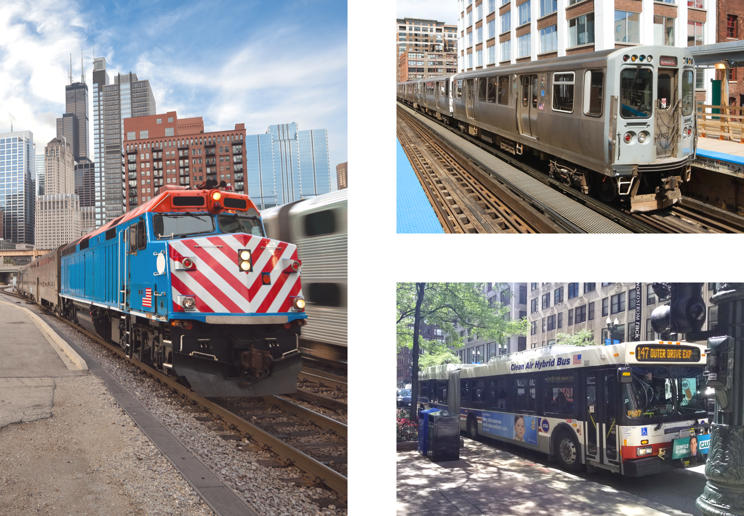
I figured I could download an app for the CTA and Metra to find transit schedules and buy tickets. By searching, I found the Ventra app where you can buy mobile tickets, receive notifications when account balances are low, and view schedules for both the CTA and Metra transit systems.
"The Ventra app sounded like the ideal commuter companion; the reality was a lot different when I used it."
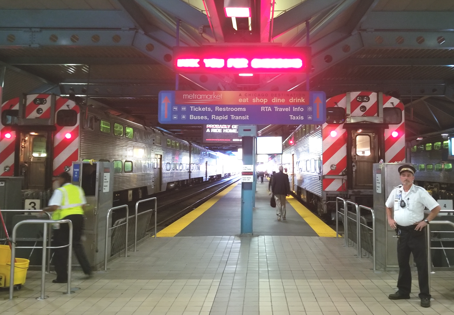
To commute from the city to the suburbs the fastest, safest, and cheapest way is to take the Metra train. I used the Ventra app to look up the Metra train schedules for my first trip back to the suburbs from the city. The first step to get a train schedule or to see departure times, I had to “Select Metra Line”.
“I was new to the city. How could I know which Metra line to take me where I needed to go?”
While in the train station, trying to figure out what Metra line I needed, I ended up asking a conductor for help to board the correct train.

Early insights
Assessing the Motive
During my train ride to the suburbs, I analyzed more of the Ventra app; I was curious about how they established other interactions. By the time I arrived at my suburban station, I had found multiple opportunities where I could improve the user experience.
From my viewpoint, the Ventra app was a disappointing experience for first-time riders using public transportation in and out of Chicago, and first-time Ventra app users. To solve these problems, I knew I needed a more inclusive design for every type of rider.

"Was I the only one with a frustrating experience?"
To understand the challenges riders faced and how they adapted to transportation, my approach was to conduct research in the form of one-on-one interviews to create rider personas.
Early on, I knew it would be essential to learn riders’ needs, behaviors, and emotions to understand their experience from start to finish. These insights would advise my strategy and guide the design of the app's experience, from crafting rider journeys and wireframes to designing the user interface and prototypes.

The Plan
Improving Usability in an Intuitive Way
In its current form (version 1.3.1), I felt the Ventra Android app had 5 core usability issues:
1. Onboarding
There was no onboarding flow, instructions, or resources to help guide riders’ first-time interactions with the app. To encourage rider engagement with the app, why not teach them how to perform key tasks, minimize potential pain points, and make the app more inviting?
Launch screen mockup of Ventra's current Android app.
2. Dashboard
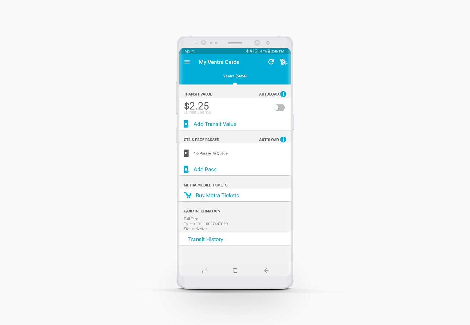
The app doesn't have a homepage, it defaults to the “My Ventra Cards” page showing a rider’s transit value in their account and any passes or tickets they've purchased. Why not begin the riders’ experience with a dashboard that allows them to choose their first task, instead of the app choosing it for them?
My Ventra Cards mockup of Ventra's current Android app.
3. Integration
Divvy is Chicago's bike share system that provides a convenient and inexpensive way to get around the city. Because of Divvy being such a popular form of transportation, why not integrate their bike system within the app to accommodate riders’ transportation options and preferences?

Transit Tracker mockup of Ventra's current Android app.
4. Processing
To view Metra and CTA schedules, you need to first select the Metra line or CTA stop you want to ride. This process only works if you already know the correct line or stop before you use the app. What if this is the first time using the app and riding the Metra or CTA?
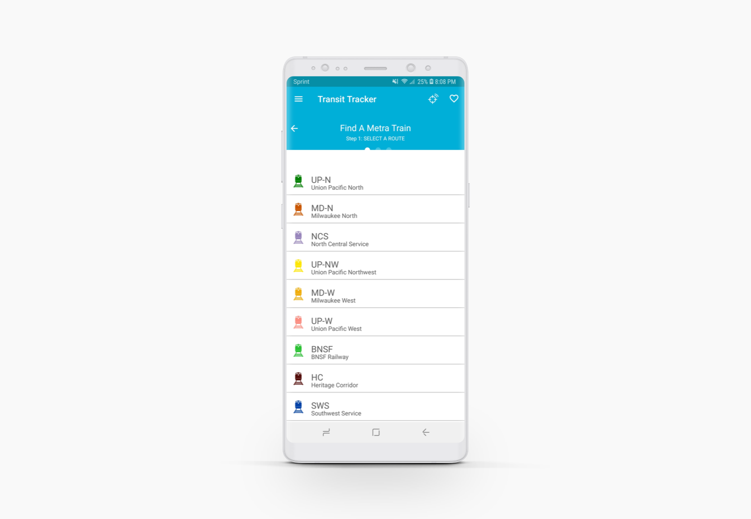
Find a Metra train mockup of Ventra's current Android app.
5. Tracking
The app provides route tracking for the Metra and CTA, but it was a text-based process that displayed limited information. To encourage rider confirmation, why not track the route in real-time with a map and even display where seating is available?

Metra train schedule mockup of Ventra's current Android app.

THE DISCOVERY
How Riders Adapt to Transportation
I began by contemplating unique problems that riders must face daily, including my own. So I created three personas, which required me to think about who I’m solving problems for, what their problems are, and what they are trying to accomplish.
To establish my personas, I analyzed those who use various types of public transit in Chicago and how they interact with it.
How do these riders experience the Ventra app?
It was important to get into the heads of each personas’ experience with the Ventra app, so I used these questions to create my personas personalities:
1. What types of transportation do you use?
2. What do you know about the Ventra app?
a. What features do you use the most?
b. What do you find the most frustrating?
c. What do you like best?
d. Which features could you not live without?
e. Which features could you live without?
f. If you could change one thing, what would it be?
3. What are your transportation goals?
To answer these questions, I interviewed friends, family and also looked back on my experiences to understand usage and requirements for Ventra app riders’. This helped me determine what information riders needed the most and the problems they face when trying to find the information.
What does ‘Ride’ mean to each rider?
My interviews uncovered that the concept of 'ride' depicted something contrasting for users of the app. Users' preferred method of transportation and ambitions for engaging with the app implied that unique requirements were vital.
Through careful analysis from my interviews, I identified behavioral variables and trends to distinguish ridership. I used these variables to compile behavior classifications:
1. Status - How savvy the persona is with technology?
2. Logic - Why would the personas use or not use public transportation?
3. Ambitions - What are the transportation goals of the persona?
4. Usage - How much does the persona use the app?
5. Viewpoint - As the persona uses the app, how do they feel?
6. Touchpoint - Why does the persona use the app?
2. Logic - Why would the personas use or not use public transportation?
3. Ambitions - What are the transportation goals of the persona?
4. Usage - How much does the persona use the app?
5. Viewpoint - As the persona uses the app, how do they feel?
6. Touchpoint - Why does the persona use the app?
This helped me sort out my thought process to adapt strategies, patterns and goals to the large and diverse ridership.
"From there I created rider empathy."
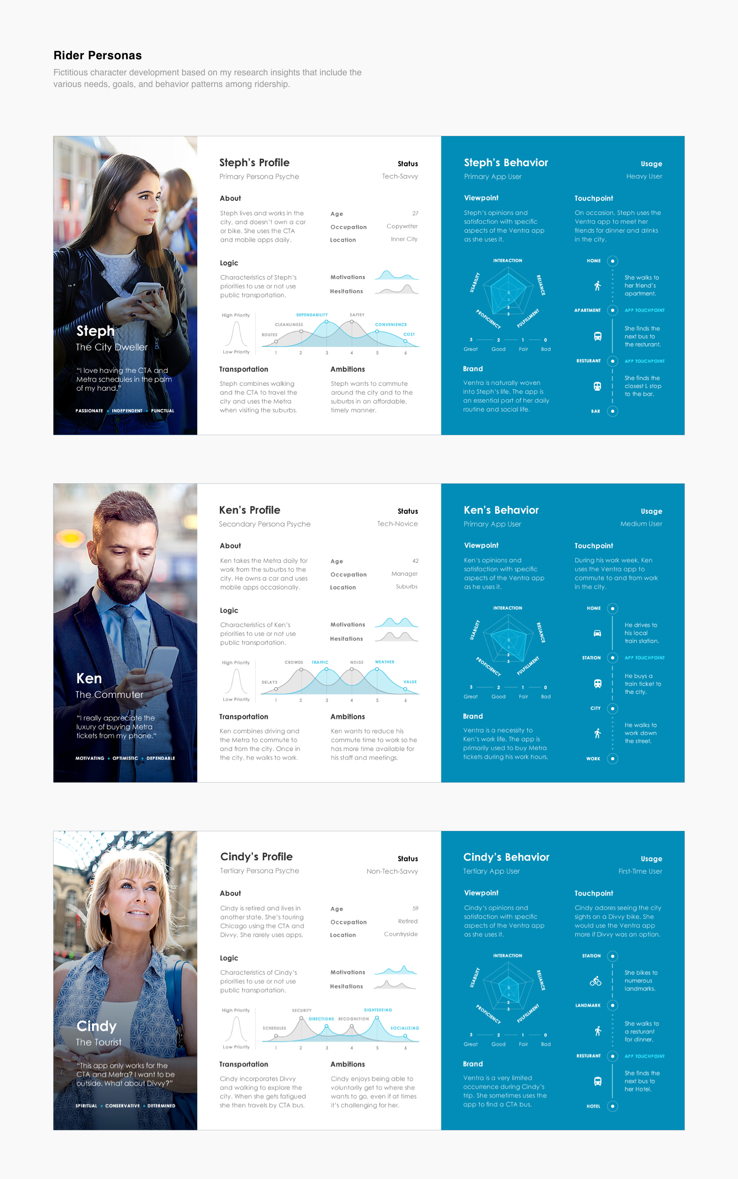
Because my primary goal was to simplify the app for the first-time rider, I referred back to my personas throughout the project to guide my approach and design decisions. I would ask myself questions like:
1. Would this help Steph, the city dweller?
2. How would Ken, the commuter, use this?
3. Would Cindy, the tourist, understand this?
2. How would Ken, the commuter, use this?
3. Would Cindy, the tourist, understand this?
Thanks to these personas, my approach for simplicity was less complex, by always keeping my personas as the inspiration for everything I created.

THE EXECUTION
Simplicity for a Generation of Immediacy
Technology’s progression has altered people’s assumption of the time a product and service should take to deliver their demands. From this perspective, along with delving into the minds of my personas, I could anticipate what tasks were useful and enhance or eliminate functionality from the existing Ventra app.
Here's how by advocating for simplicity, I took intricate tasks and translated them into intuitive, accessible, user-friendly interactions, helping riders achieve their immediate intentions.
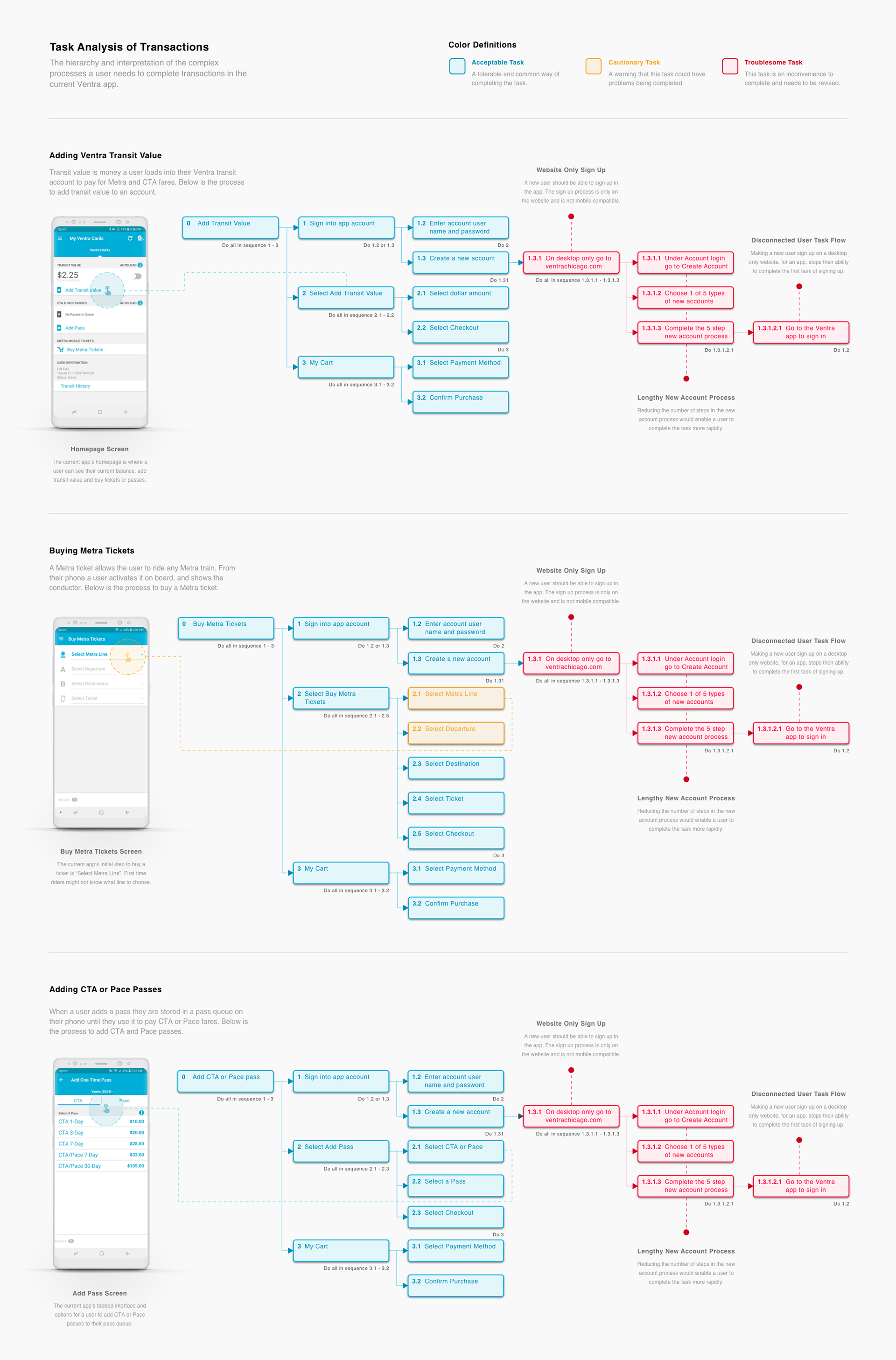
Task Analysis
To have an extensive understanding of the app's current architecture and processes, I analyzed the steps and behavior needed to complete 6 common tasks in the Ventra app's current form. I divided my task analysis into two groups Transactions and Transportation, this made it possible to allocate the favorable tasks into a journey map to understand the process a user goes through to achieve a goal.

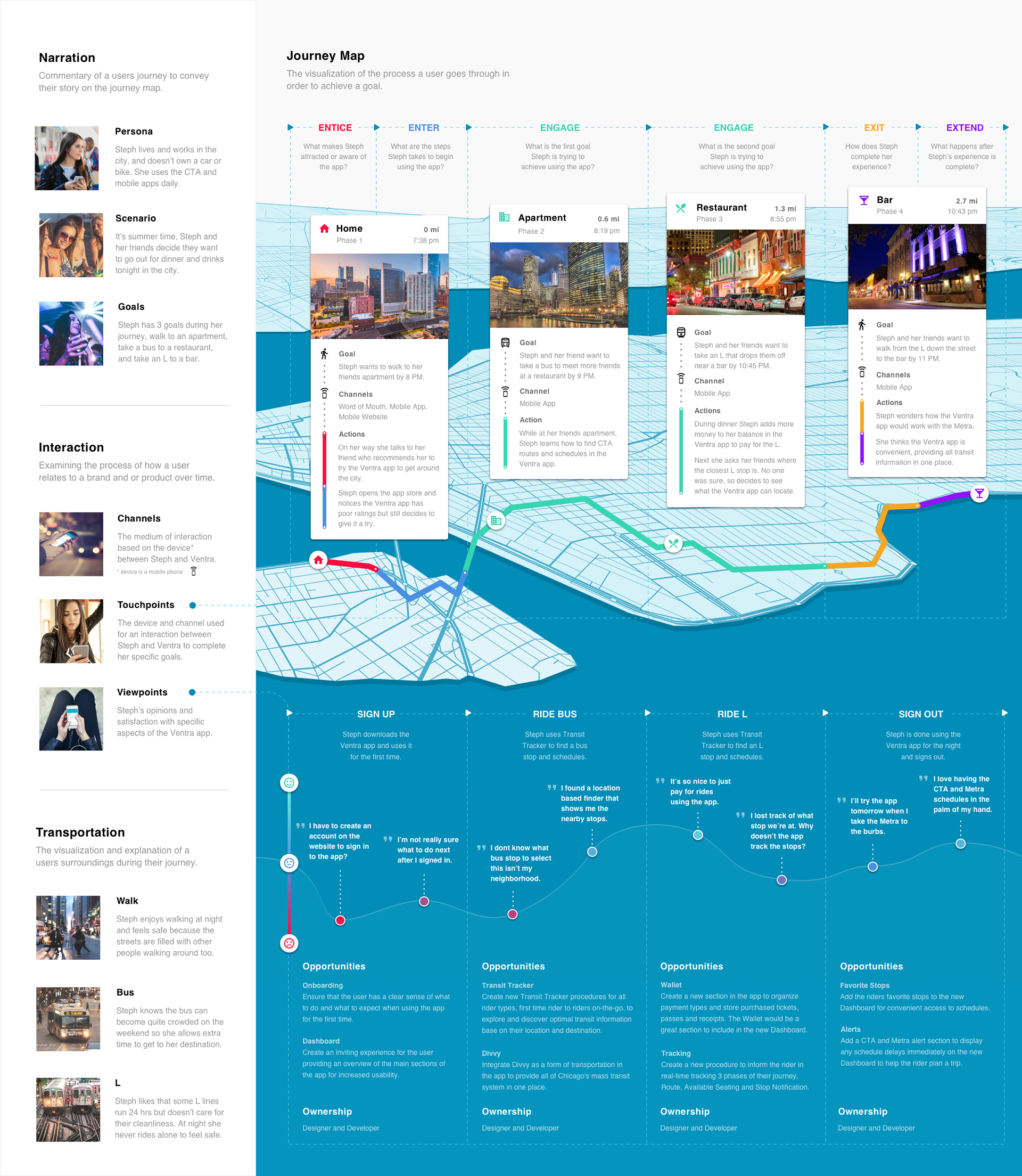
Journey Map
Next, by expanding on each personas’ touchpoints and viewpoints, I could compile a sequence of their goals and actions into a timeline. This gave me insights to pinpoint which steps in their journey I could maintain, revise or redesign. Because of storytelling and visualizing the process to achieve a goal from the journey map, I assembled new task flows from the personas perspective.

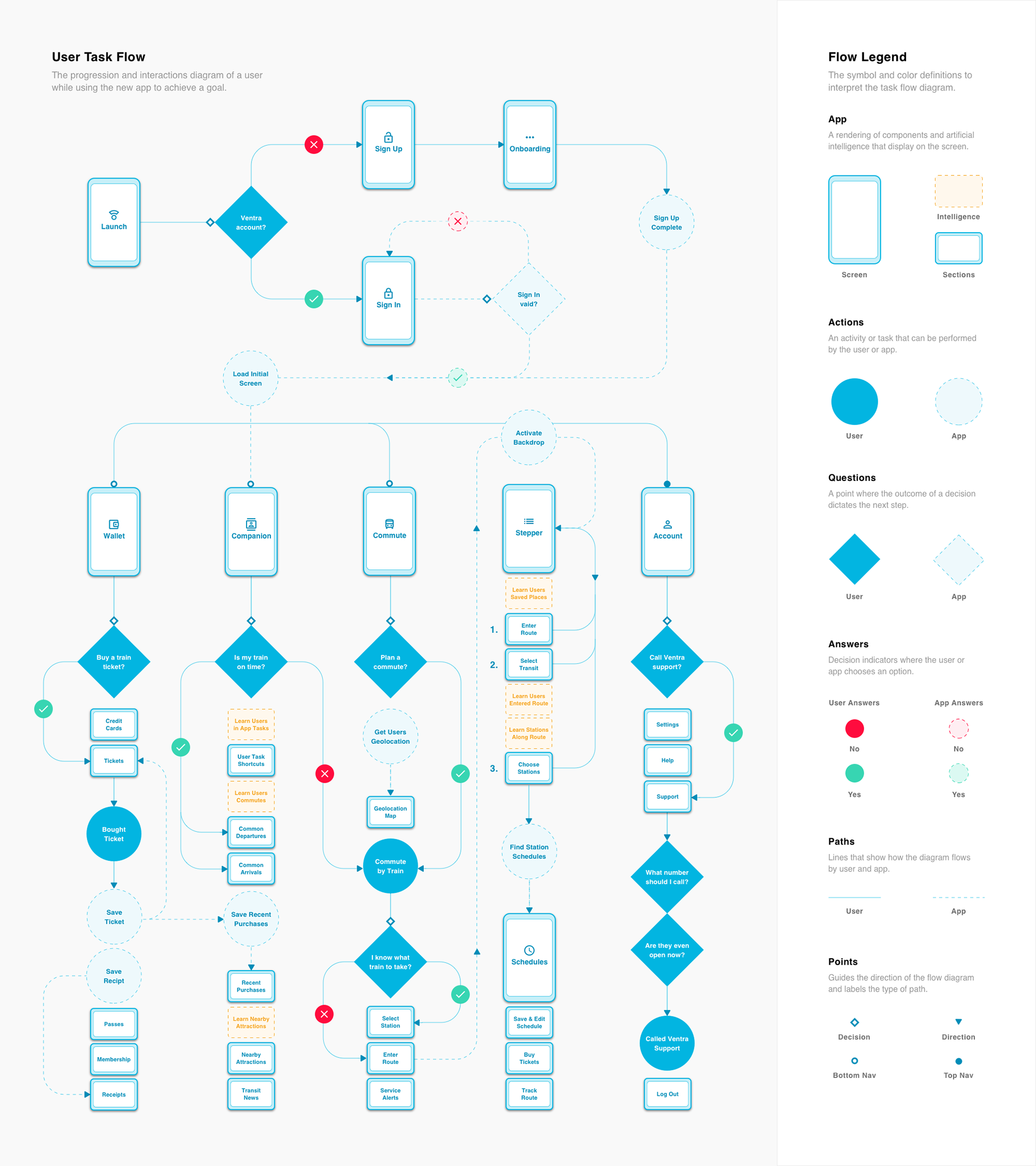
User Task Flow
Then, it was essential to determine how screens and components would associate with one another. To achieve this, I organized, structured, and labeled information and actions into a user task flow, outlining the routes a persona traveled within the app. This provided me with a diagram of my new architecture, verifying the paths of least resistance to base my design decisions on the personas intent.

Wireflows
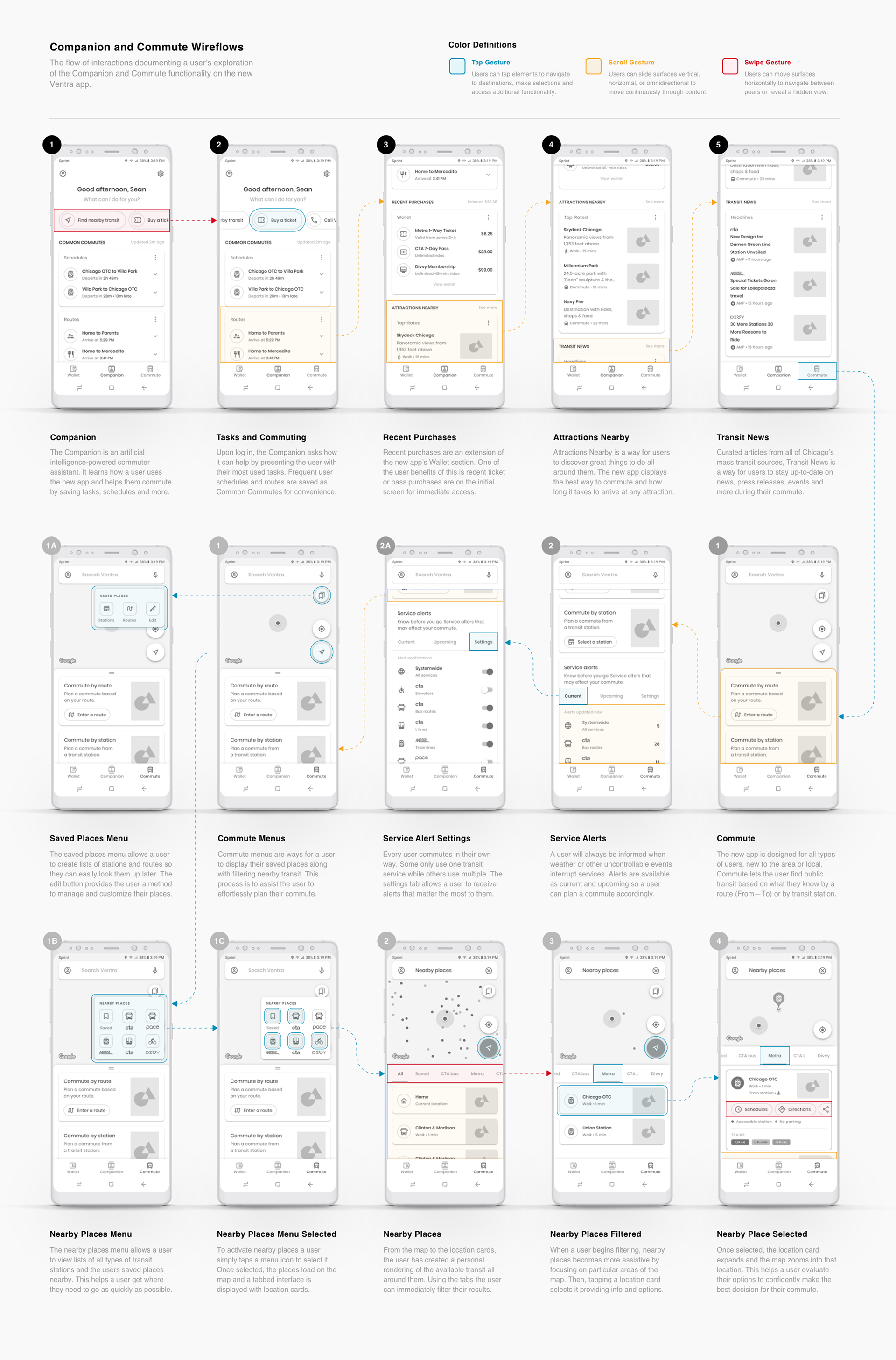
I enhanced my wireframes with realistic aspects of the interface to conduct cognitive walkthroughs so I could understand the learnability of my app’s system. This resulted in 4 comprehensive wireflows describing user approved task flows and interactive behaviors. By sequencing user interactions, when a user resorts to an action and confirmation of that action, my app's system began to show signs of life.


Overall, my execution for simplicity involved a deep understanding of user task flows and interactions of the current Ventra app. I converted meaningful solutions into wireflows to create high-fidelity design concepts.

THE CONCEPT
A More Inclusive Design
Every design decision has the influence to exclude or include users. Inclusive design diminishes savviness necessary to use a product and enhances the user experience for everyone in a variety of circumstances.
To reiterate my plan, I felt the Ventra app, in its current form (version 1.3.1), had 5 core usability issues:
1. Onboarding - There was no onboarding flow, instructions, or resources to help guide riders’ first-time interactions with the app.
2. Dashboard - The app doesn't have a homepage, it defaults to the “My Ventra Cards” page showing a rider’s transit value in their account and any passes or tickets they've purchased.
3. Integration - The Divvy bike share system was not integrated within the app to accommodate riders’ transportation options and preferences.
4. Processing - Processes for looking up schedules only worked if you already knew the correct line or stop before you use the app.
5. Tracking - The app provides route tracking for the Metra and CTA, but it was a text-based process that displayed limited information.
By analyzing everything I could about riders behaviors, needs and environment, the interface design strives to foresee what the first-time rider to daily commuters demands are, to ensure a delightful journey. All my design decisions focused on the diversity of riders and the influence of this transmits a sense of certainty in the design.
Here’s how I implemented my plan to improve usability by designing for inclusivity.
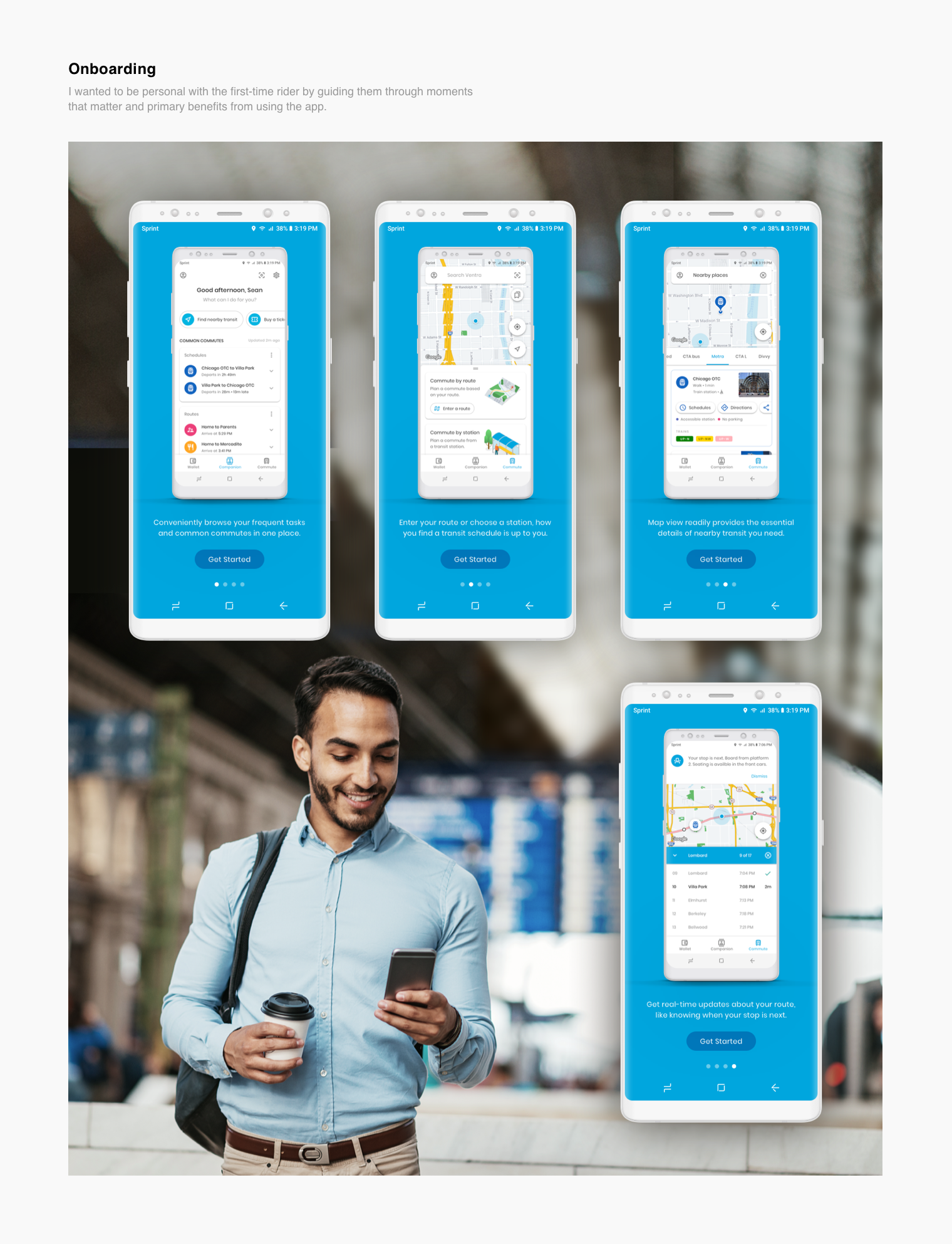
1. Onboarding
Since the current Ventra app never included onboarding, I felt this was the perfect place to start. What kind of experience did the first-time rider deserve, and what were they trying to accomplish? I needed to ensure that they had a logical sense of what to do, where to go, and what to expect when using the app.
Onboarding instructs riders how to have the best experience right from the start.
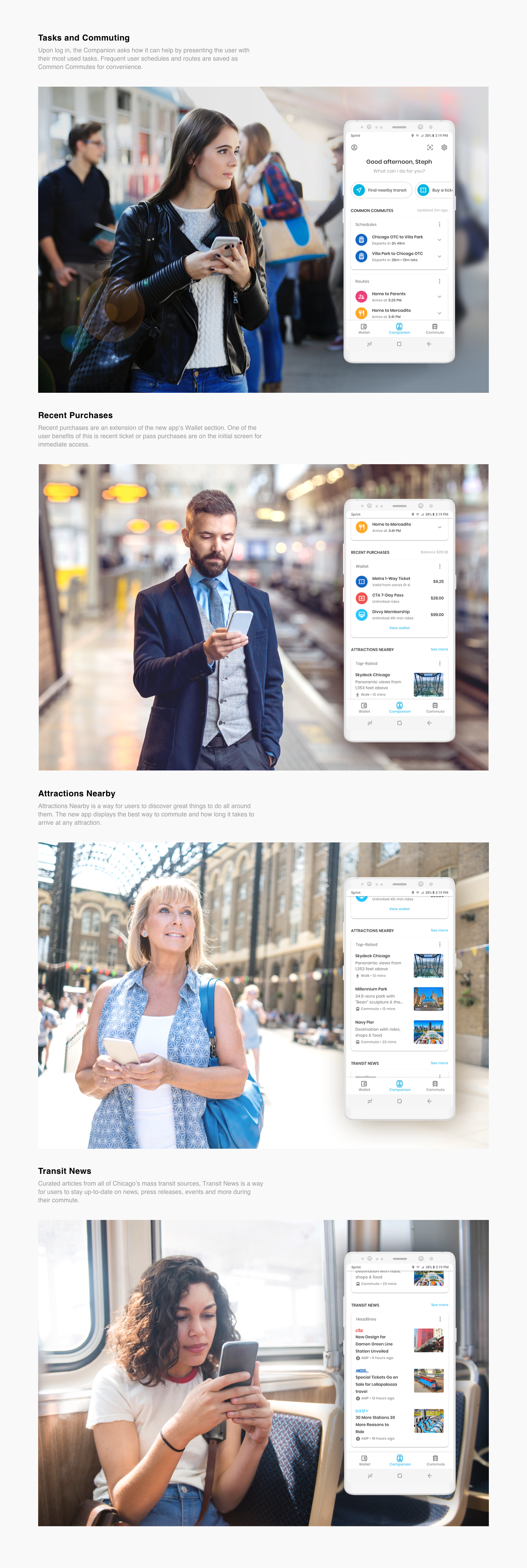
2. Dashboard
After logging in there wasn't a dashboard in the Ventra app, instead it defaulted to a page that stores the riders transit value, passes and tickets purchased. As a user, this was not an inviting experience. It felt forced, as if the app was choosing what I should do, by not providing me with options.
By following the experiences and mindsets of my personas, I designed a dashboard called the Companion; an artificial intelligence-powered assistant that learns how a rider uses the app (ex. saves common schedules and routes) to make commuting better. The Companion also recommends attractions and provides the latest transit news for first-time riders to discover exciting things all around them.
The dashboard is the first impression a rider experiences, the Companion, and I wanted to make a good one.
3. Integration
By staying true to my scheme of inclusion brought me to question, “Why wasn't the Divvy bike sharing service integrated into the Ventra app?” They place their bike stations around CTA and Metra stations, providing a fleet of bikes to commuters and tourists 24 hours a day.
Integrating Divvy accommodates riders by combining Chicago's mass transit system in one place
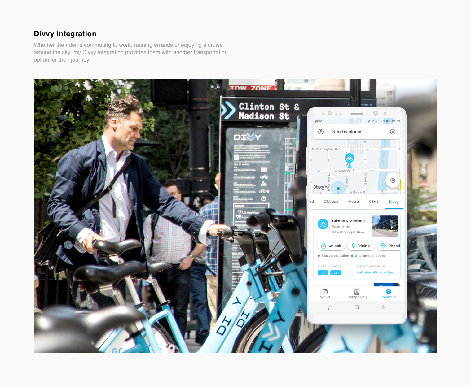
Photo attribution: “Chicago Divvy Bike Sharing (Clinton/Madison)” by Tony Webster used under CC BY 2.0 / modified from original by cropping image and adding my app design.
4. Processing
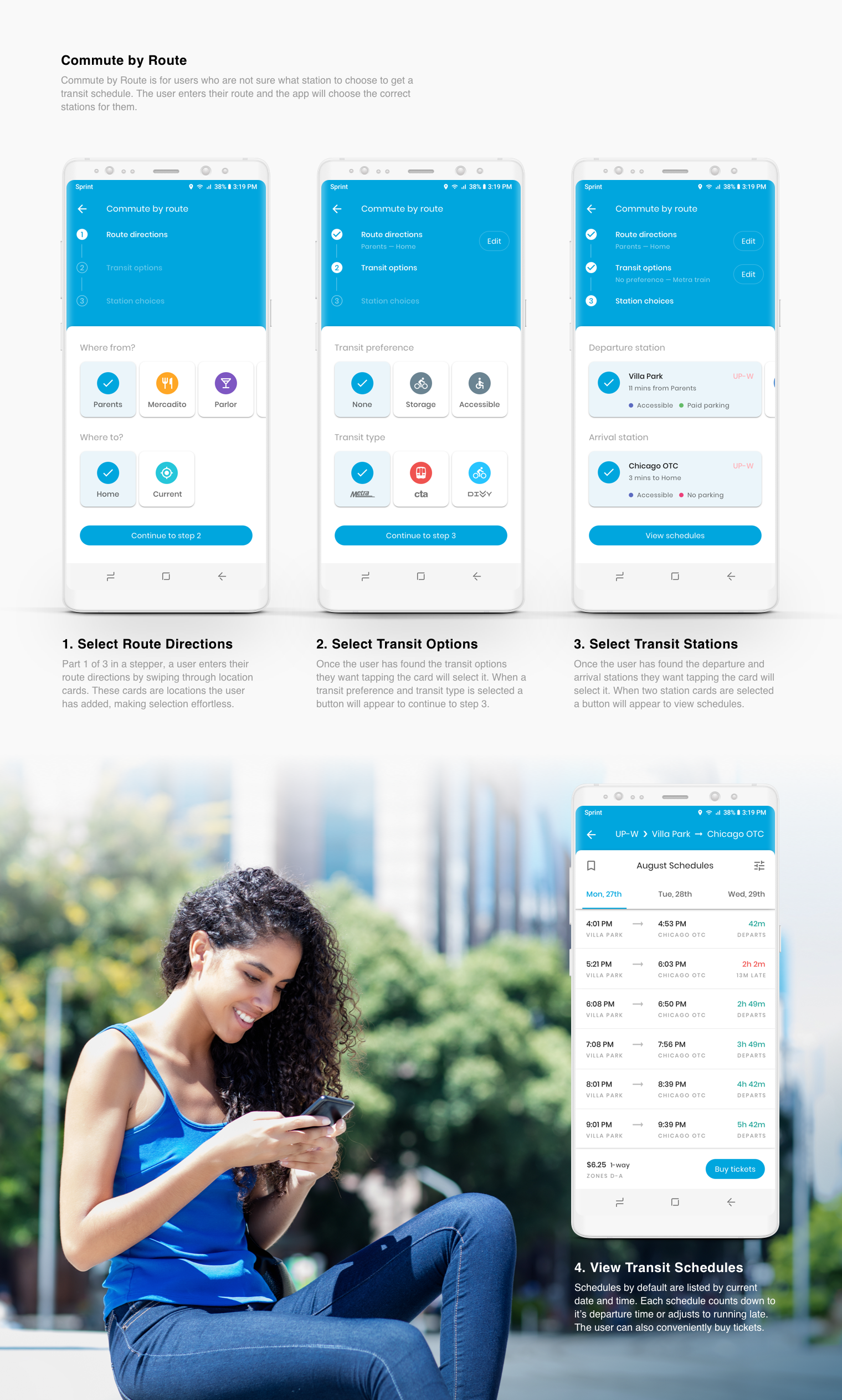
In my viewpoint, the most extreme instance of exclusion in the Ventra app was the procedure to view transit schedules. Asking someone new to the area to enter a Metra line or CTA stop to view schedules is information they will not know. The first-time rider can not complete their goal.
In the age of immediacy, my new procedure to find a schedule guides the rider to explore and discover optimal transit information in ways that are predictable, understandable and actionable.
By favoring first-time riders on-the-go, my concept finds a schedule based on the information that the rider already knows.

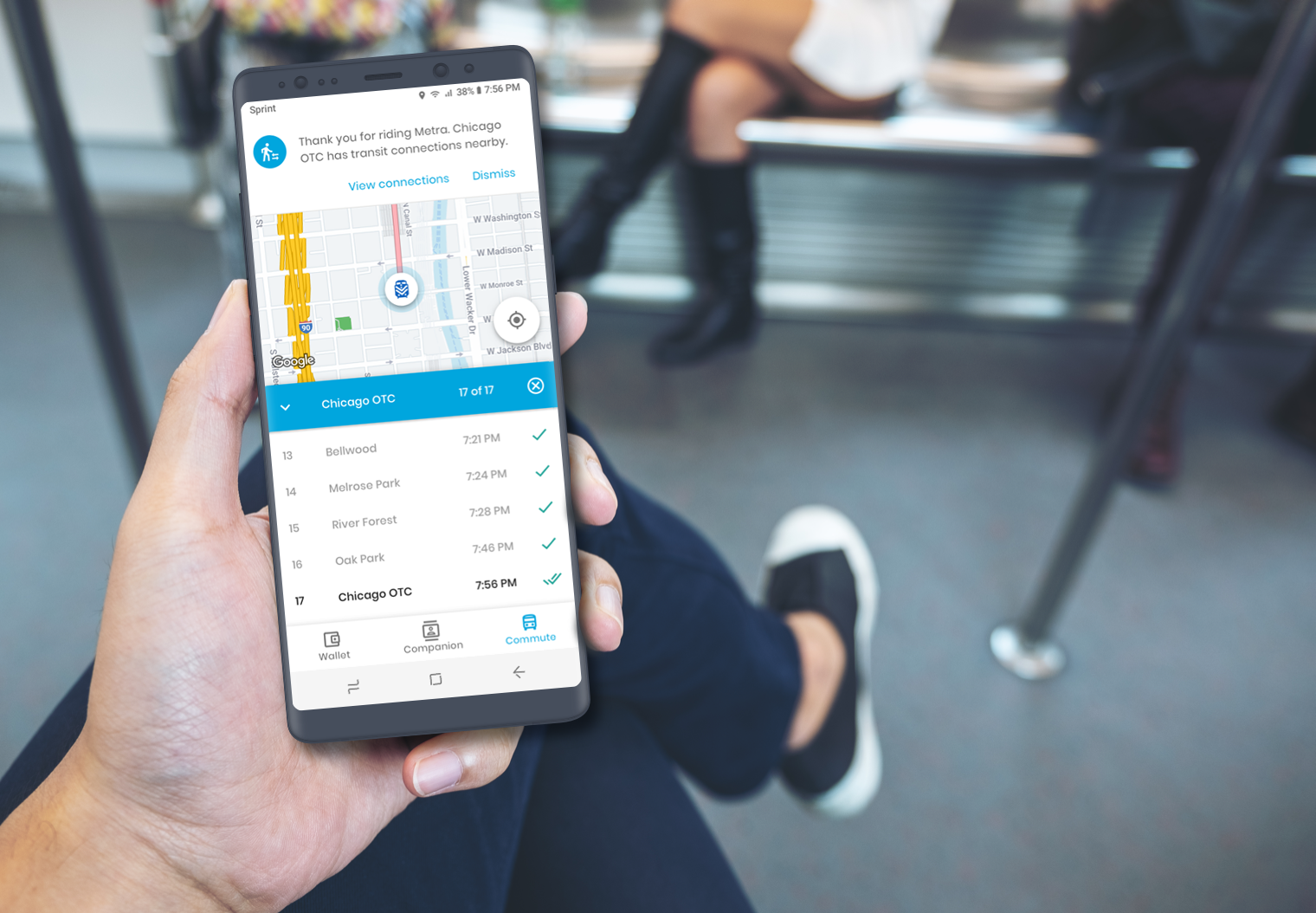
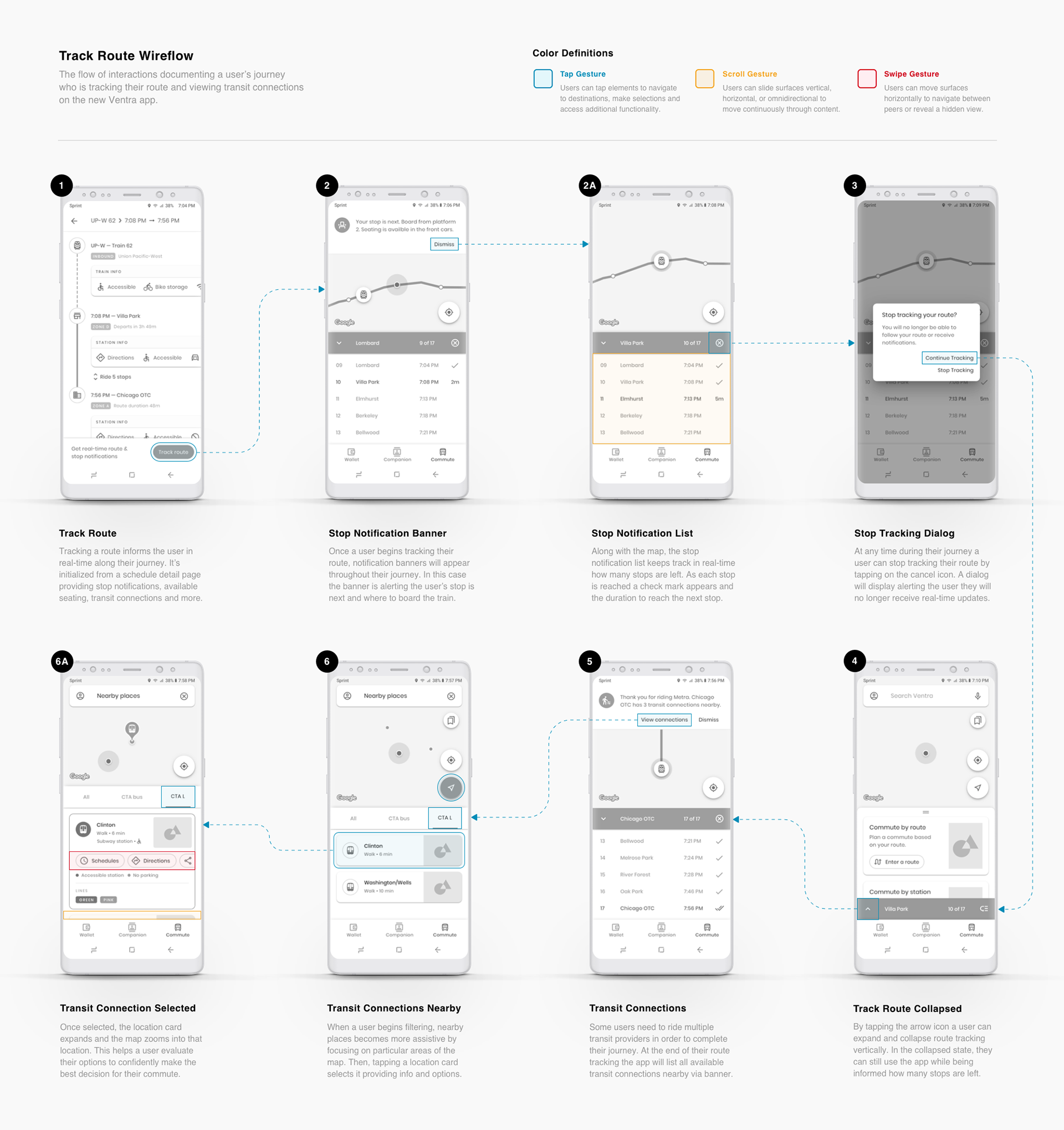
5. Tracking
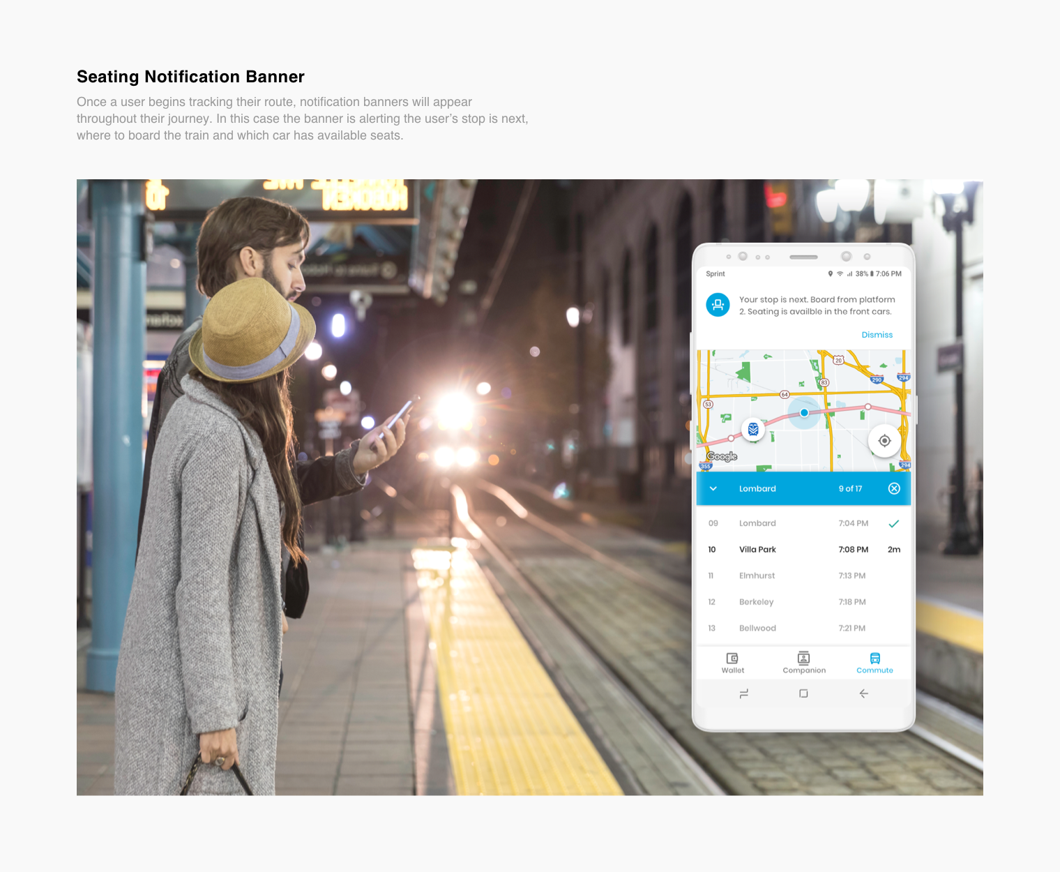
As a commuter, I had a few enduring complications that I resolved through my design concepts for tracking the Metra train. I felt these solutions would also benefit the CTA L and bus riders. My procedure informed the rider in real-time during 3 phases along their journey:
1. Route Confirmation
The text-only route tracking in the current Ventra app doesn’t do much for readability in direct sunlight and has no visual cues for fast communication or confirmation. I wanted to present tracking the rider’s train by data visualization, which is more convincing.
Not knowing when the train was arriving was a frustrating way to start my commute.

2. Available Seating
Since there is no assigned seating on Metra trains in order to track seating availability my theory leverages NFC ticketing. The Metra conductor would log into the Ventra app and would have their own section to validate NFC scans. To begin with, they would type in the train car number they’re in, then with their phone scan the rider's phone to track their NFC ticket. The scanned ticket location alerts riders by notification banner on the app who have not yet boarded the train.
Having insights to which train cars have seating would have made boarding more suitable.

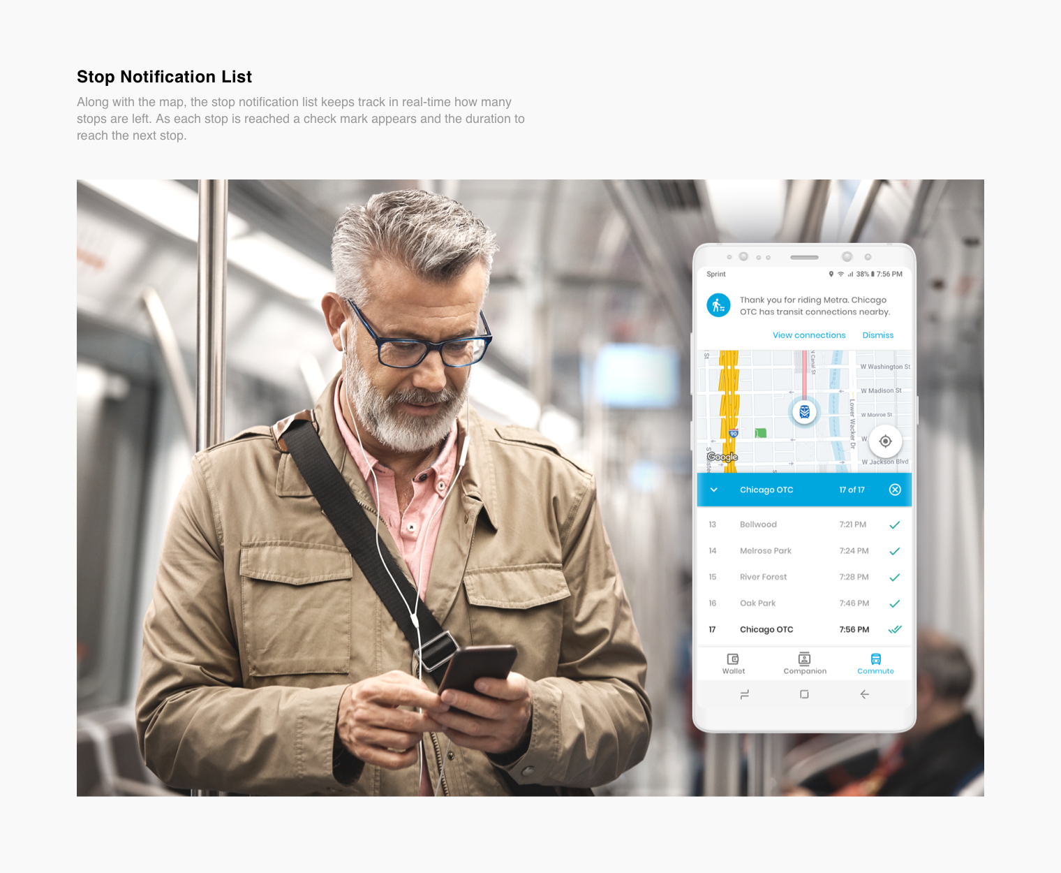
3. Stop Notification
The Ventra app had no way of notifying the rider when they arrived at their stop, which can be an obstacle because not all Metra train car speakers work. On occasion, I could not hear the conductor announce what stop we were at. This has also happened at night, giving me limited visibility outside the window to know where I was.
My solution was to display all stops in a list format. As a rider reaches each stop a check mark would appear, tracking how many stops are left and alerting the rider with a banner upon arrival at their stop.
My solution was to display all stops in a list format. As a rider reaches each stop a check mark would appear, tracking how many stops are left and alerting the rider with a banner upon arrival at their stop.
The stop notification list would have always kept me aware of my location and time of arrival.


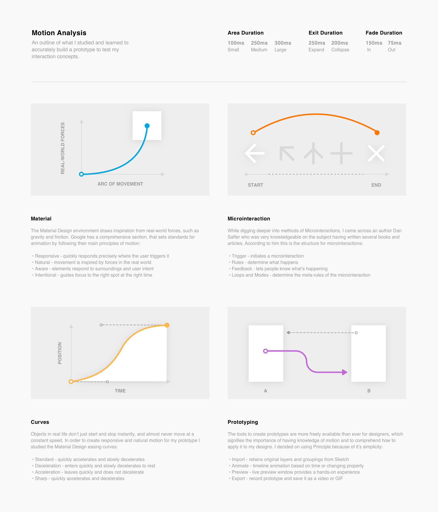
MOTION ANALYSIS
Rider Certainty Through Micro Moments of Motion
Motion has the potential to bridge the gap between the user and technology, forming an emotional and human connection, while also encouraging them to keep coming back for more. This perception of animation and transitions, called microinteractions, are micro moments that enhance the rider’s action from ordinary to extraordinary.
Once I discovered how influential animation is when applied using a sensible yet delightful approach, I saw this as an amazing addition to my skill set. I educated myself on how Google uses motion, explored microinteraction theory and experimented with Principle to fuse motion and interaction into something tangible.

IMPACT & RESULTS
High-Fidelity Prototypes for High-Priority Riders
To influence the rider’s experience and push the limits of what I learned, the interactions I created were a balance of positive assurance with focused attention and engaging moments while on their journey.
Below are 4 videos of the app’s core procedures that allow my interaction concepts to prevail in ways intended to feel inspired, sophisticated and enchanting.
1. Commute
Explore, discover and navigate public transit from the city to suburbs.
2. Commute by Route
Find transit schedules and stations based on a route and transit type.
3. Tune Schedule
Edit previously entered information to update a schedule's timetable.
4. Track Route
Informs the rider with real-time notifications along their journey.
The purpose of this project was to demonstrate a working knowledge of Sketch, Principle and Material Design by implementing an Android app concept.
I feel I accomplished this by achieving the following:

Using Sketch, communicated influence and guidance of a product design strategy from scratch.

Using Principle, demonstrated meaningful mobile app improvements to actual user problems.

Following Material Design, constructed prototypes aware of guidelines, constraints and limitations for Android.
Even though these are prototypes, the real world results I would expect to see are:

Increased User Adoption
Immediate user adoption with help from onboarding and clear calls to action.
Increased App Downloads
Increase in app downloads as a result of positive word of mouth referrals.

Increased Divvy Usage
Increase in Divvy plan purchases and bike usage due to addition in the app.

Efficient Metra Seating
Seating for Metra riders would be more efficient due to app seating notification.

New Best Friend
The Companion would be used multiple times per day, making commuting better.

VENTRA VISION
Continuing The Concept
After reimagining the user experience of the Ventra app, I watched the Google I/O event introducing Google Lens, their new visual search app. Lens analyzes the visual data of an image and then performs several specific tasks based on understanding image content.
I felt a deep connection to its purpose, inspiring me to continue working on my transit app concept. By once again following the experiences and mindsets of my personas, I put myself in a few exciting scenarios of challenges they could face.
Below are 4 videos of how I envisioned applying Google’s Cloud Vision to make my app identify, adapt and learn user needs, meet Ventra Vision.
1. Identify Stations and Routes
Find out how late a station is open or when the next trains arrive.
2. Discover Where to Sit
Pinpoint parts of the train that have seating before boarding.
3. Scan for Schedules
Look up schedules right from their sign without having to type one word.
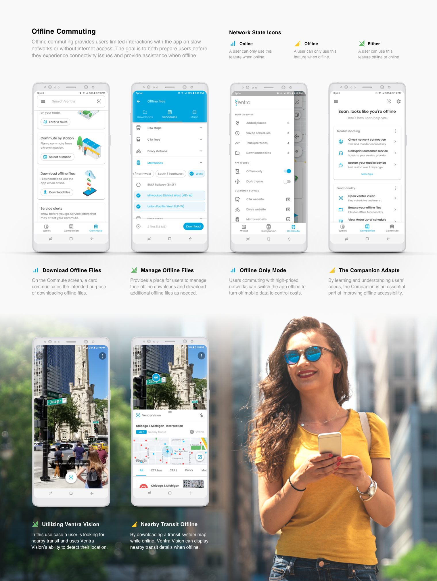
4. Nearby Transit Offline
No service? No problem, just point at an intersection to see transit nearby.
Conceptualizing an Offline Commute
I liked the scenario of using Ventra Vision for commuting while offline and visualized implementing this concept. I began by developing a mental model of the flow a user could take both on and offline in the app and how to improve accessibility through inclusive design, appropriate language and meaningful visuals.

The thought of using an app while offline was a fascinating concept that made me curious about how to make it useful in a riders’ daily life. My intention was to educate, prepare and provide positive reassurance to help speed up tasks for users to thrive during an offline commute. This lesson in accessibility taught me how to interpret new environments, understand relationships between new functionality, and respond to users’ needs with new technology.

TEAMMATE Testimonial
Stephanie Keltner
“No matter what he’s working on, Sean follows the motto - Great Isn't Good Enough.”
"He is an incredibly talented designer who puts 200% of his effort into every project he works on, keeping the needs of our end users at the forefront of his design process. Sean takes pride in pushing the limits of creativity to find the best possible solutions for our clients--but the projects don't end once the deadlines hit. Sean regularly revisits his work to tweak, refine and improve every detail as the needs of our clients change and adapt. For one particular lead generation website he built, his design elements weren’t only beautiful--they increased the conversion rate from less than 20% to nearly 70%! Sean never does anything halfway and it definitely shows. Our hundreds of clients love his work and his passion for gorgeous, innovative UI/UX design would be an asset to any company."
Stephanie and I worked together for over 1 year in different teams. She was on the marketing team as Creative Marketing Manager - Content Development.